10 Golden Rules for Successful Creatives
•
blogContext:
- Make the right choice of format based on the objective (for traffic, prioritize short formats, etc.)
- Put yourself in the user's shoes (Is the format understandable? Respectful? Would you click if it were you?)
Text:
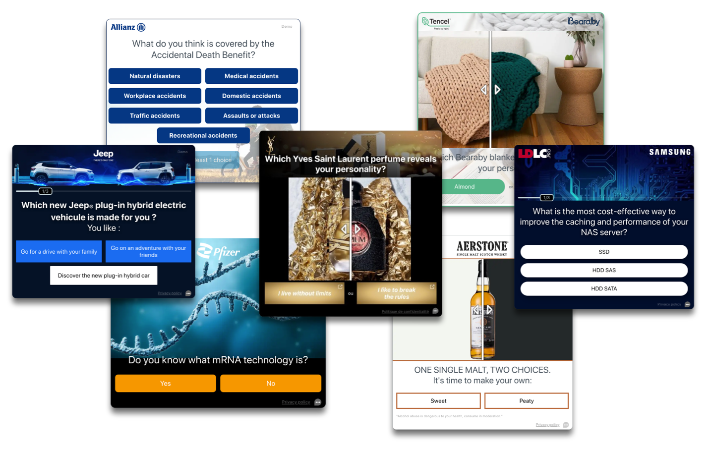
- Questions that are short, precise, and avoid indicating the brand or product name in the first question generate more attraction for the user's eye.
- Elements of precision ("Do you intend to buy a car in the next 2 months?"), formulations that involve the user ("Do you know," "In your opinion,"...), and questions of general culture or those based on the user's experience, opinion, or current condition foster their desire to respond.
- In the case of redirection at the time of voting, make it clear to the user through the wording that they will be redirected to avoid any surprises and limit the bounce rate.
Visuals / Design:
- While staying within the height constraints set by publishers, and if you are not presenting a range of products, answers that are all visible on the screen generate more clicks than in "Carousel" mode.
- Limit very "ad-like" images or those with too much information to resemble editorial content.
- Imported images must be of good quality.
Call to Action (CTA):
- Use an action verb in the CTA.
- The CTA should be simple, short, clear, precise, and consistent with the product being promoted.
Did you like this article?
© BeOp 2015 - 2025
Made with 💚 by the BeOp team